UX for people and AI agents: practical help with everyday tasks
How to design accessible interfaces for humans and predictable integrations for AI agents without adding unnecessary steps.
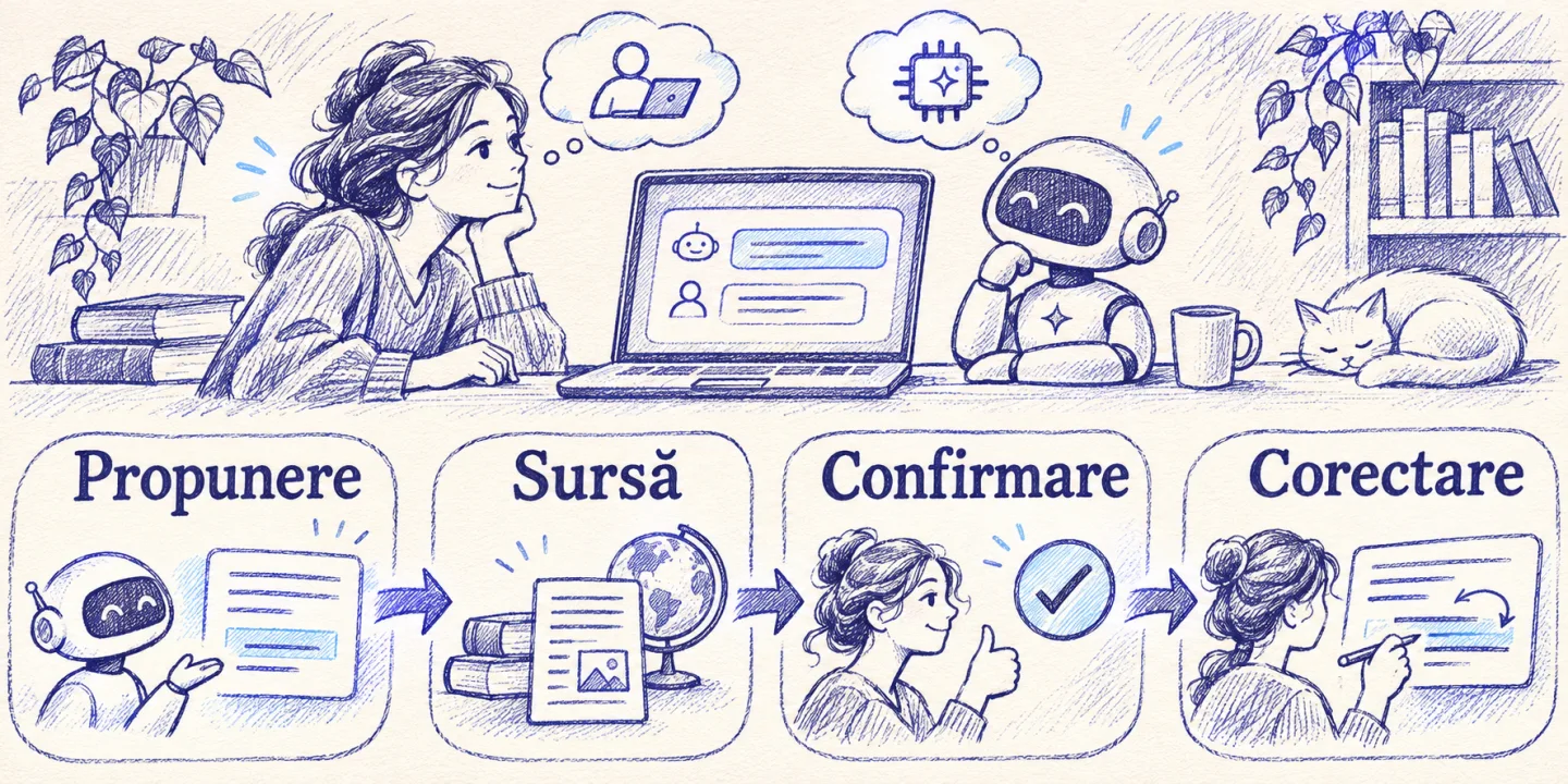
UX for humans and AI agents means giving a human a clear experience and an automated system a predictable contract. The person sees what is happening, what they can change and who approves. The agent receives explicit states, limits, and operations. When the two surfaces apply the same rules, the user can switch from automation to manual control without losing context.
This problem occurs in small activities. An assistant can gather options for a meeting, group emails, or turn a document into a checklist. The benefit is lost if the person has to compare three calendars, check each promise, and re-enter everything in the final application. The best design question is “what work is effectively disappearing for this person?”.
When does AI simplify an everyday task?
It helps when the system can propose a useful result with easy-to-pass inputs and proportional verification. For a long email, a summary of the relevant passages can save a full reading. For an ambiguous question, a list of clarifications can avoid repeated exchanges. For a shopping list, grouping items by category can be enough without connecting your payment account.
Think about planning a date with three colleagues. The manual process involves checking availability, proposing a slot and confirming. A good product can find ranges based on allowed dates and show the proposal, with time zone and participants. The person can change the interval or cancel. A product that generates text about possible dates, but forces you to check and create everything from scratch, has less value.
A task becomes more complicated when verification has a high cost or when a plausible result can hide an error. In the case of an invoice or contract summary, always compare the relevant data with the original before taking action. In the design, put the amount, term and source in the same screen. If the information is missing, it allows marking it as unknown and shows how to fill it in from the authorized source.
What does it mean to design for an agent?
An agent is a program that can choose and call tools to track a task. For programmatic access, it provides purposeful operations, well-defined data, and errors that indicate the next step. A “check availability” operation is distinct from one that makes a reservation. A command that generates a preview of a change has a different effect than a commit. These limits must be implemented in the service, regardless of how the agent interprets the instructions.
Important information must be able to be conveyed in a structured form. A response like “range unavailable” should be a status with details about what can be done, such as redoing the search. If the request was cancelled, describe both the status and the identifier. When the result contains values, it preserves the units, date, time zone, and expiration rules. These details keep the interface or agent from guessing.
Robustness also requires limits. It allows access to only the necessary operations, with the right identity, and asks for confirmation when an important consequence occurs. The response may include the status of the approval, and the service checks whether the approval belongs to that operation and is still valid. If the agent loses the connection, it can query the state without uncontrollably repeating the effect.
How do you synchronize the API contract with the UI experience?
| Moment | What does man see? | What the integration gets |
|---|---|---|
| Proposal | Editable result, source and missing fields | Structured values, provenance and draft status |
| Waiting | Stage and a way forward | Identifier, status and possibly term |
| Confirmation | What will change and who is affected | Bounded operation and verifiable conditions |
| Error | Reason and instruction for correction | Error code and relevant fields |
| Cancellation | Effect of cancellation and data retained | Final status or cancellation request in progress |
It projects the states in the language of the domain. “Under construction” may describe a draft, but “awaiting peer approval” indicates a dependency. Use terms that have the same meaning in the interface, documentation, and log. A common name also helps when the client passes an identifier and an operator needs to find exactly when the process stopped.
A simple test tracks the same request from multiple channels. Start from the interface, find the identifier in the API and continue manually. Confirms that a change made by the operator is visible in both places. If an old draft version can overwrite a recent commit, use a version check and explain the situation in the interface. People need a way to review the differences before applying.
How do you stay in control when the outcome can be wrong?
It begins with a delineation between recommendation and action. For an internal list, review may just mean a tick. For payments, cancellations or sending to an external person, the preview must clearly show what applies. It highlights changed fields, recipients and situations that cannot be reversed. If the operation needs to be confirmed again after a major change, clearly state why.
A user may accept a proposal because it seems coherent. The design must give him reason to check it where it deserves it. It shows the source next to the statement, differentiates missing information from a confirmed value, and groups fields that require attention. For time-dependent responses, show the date the check was made. A model cannot guarantee the availability of a resource after its state has changed.
When the user edits, it keeps the edit. If they move an appointment or edit a message, the next generation should take into account the expressed intent or ask permission to replace the result. A flow where the AI repeatedly rewrites the corrected fields produces additional work. For larger edits, it shows the differences and lets the user apply only the parts they need.
How do you make an AI product accessible?
Test routes with keyboard, screen reader and on a narrow screen as well. Labels should describe the operation and errors should be linked to the appropriate field. For a continuously streamed result, ads for each snippet can interrupt browsing. It uses reachable state and provides predictable result access, stopping control, and a logical order of focus. WCAG 2.2, W3C recommendation
Clarity of language is also important for people who do not use an assistive device. Instead of showing “insufficient context”, it says the original date is missing and where the person can fill it in. Avoid marking states by color alone. Display a text label for error, warning, and success. For long forms, it preserves the values on validation and tells how to get to the first field that requires attention.
Compare channels too. A voice message can be useful when the person is busy, while a written confirmation is easier to check and reopen. A person can start on mobile and finish on computer. Keeping state and options between channels allows her to choose the instrument that suits her situation. UI/UX Principles for AI Interfaces
How do you test if an assistant reduces work?
It starts with three plausible scenarios. A complete case, one with missing data, and one where the person changes their mind. For planning, include a disappearing interval between search and booking. For extracting documents, it includes an unusable attachment and an almost identical field in two sections. Check that the person understands what has happened and how they can proceed.
Compare resolution time, errors and recoverability. You can record when the user switches their attention to another app or checks the same thing multiple times. Ask him what he understood after he finished, not just if he liked it. A participant may praise the speed and still think an action has been executed when the application has only saved a proposal.
For a personal task, you can do the same test for a week. Choose only one type of activity and note the time for entry, check-in and transfer in the final application. If the benefit is repeated, keep a template. If the instructions are longer than the actual work, simplify the flow or do the task directly. Examples of AI in everyday life
How do you choose the information you show first?
It displays the result that answers the person’s purpose and allows a decision. In a scheduling request, this can be the list of time zone slots and the cost of a change. In an expense summary, there may be the total, the period, and the entries that need to be corrected. Model information and technical details may remain available where auditing, support or comparison helps.
For a long output, separate sections with headings that make sense independently. A user who opened a reply from a notification needs to understand the purpose without looking up the original conversation. Keep the essential field next to the action. If the person sees the amount on one page and confirms on another without context, the likelihood of a mistake increases. Test the interface with real length data as well, including long names and incomplete responses.
How do you design the transition to the operator?
In a customer service, the transfer should keep the issue, confirmed information and resolution attempts. Ask for consent where necessary and show what the operator will see. If the person can edit the summary, they will be able to correct a misunderstood intent before the transfer. A request identifier can help when the conversation continues through another channel.
The operator needs the relevant data, the source and the ability to change the state. A summary may show that the person is requesting rescheduling, that the original interval is gone, and that no change has been made. Thus, the operator starts from verifiable information. If the history includes data it doesn’t need, it restricts access by role. Separate what the client stated from the conclusion generated.
It measures retrieval time and how often the customer has to repeat the information. In a test it may appear that the transfer is working because a ticket has been created. Check that the ticket reaches the right person and that they can respond. When the operator returns later, the system must know that the automatic session has been taken over and avoid proposals that contradict a sent response.
How do you decide what to keep from the experiment?
Take an example where the assistant writes a reply to a service message. Measure manual drafting first. Then test a variant that suggests text and one that lists only the dates and the remaining questions. The individual may find the list more useful, as the tone varies greatly between clients. In this case, simplify the interface and use redaction only in situations with clearly defined templates.
For the product, test and how much a fix costs. If a user has to redo a long form after changing an option, the recovery effort can negate the initial benefit. Keep fields independent and explain which values become incompatible. A good experience also means that the solution helps when the original plan changes.
When the team is discussing a new feature, put a few complete examples on the table and choose just one change to test. It can be displaying the source next to the field, a stop control, or a shared state between the API and the application. After the test, it keeps the version that the user understood and was able to correct. The effect is easier to maintain if it remains tied to a concrete behavior, observable at each update.
When does repeated automation deserve dedicated control?
If the same team asks for the same summary every day, notice which fields, sources and steps are repeated. You can turn the intent into a simple form with matching options and preview. The agent uses a stable contract and the person does not rewrite instructions. For unusual situations, you can also keep a free entry, but show from the beginning what is checked manually.
Test the change with a real task. If the user solves most of the cases in the form, it tracks separately what happens to the rest. An efficient function for common types must also allow a path for requests that do not match. When you add options, each should have a consequence that the person can understand and that the service can validate.
Frequently asked questions
Do all AI products need chat?
No. When the task has clear fields and repeatable states, a form or button can provide a shorter route. Chat is suitable when the intention is difficult to express through fixed options. The interface can combine conversation with clear tables, confirmations and buttons.
What personal tasks are good to start with?
Try rephrasing a message, structuring your own notes, or proposing study questions. Choose data you can use and a result you can verify. Delay connecting sensitive services until you’ve measured the benefit.
How do I know if an interface is also useful for an agent?
Track the operation through a documented API or contract. Check the status, identity and what happens when the request repeats or times out. The agent must be able to choose the next step without interpreting colors, gestures or unstructured messages.
What are you designing for the first time?
Draw a normal route and an exception route. For each, write what the human sees, what the automation can do, and where it can be corrected. Choose a result that you can test in a real working day. For products that interface with existing systems, see John.Cloud applications and automations.