UI/UX in the AI era: designing interfaces that help
How product design changes when AI comes into the interface: from chatboxes to guided flows, transparency, control, error management and accessibility, with immediately applicable principles.
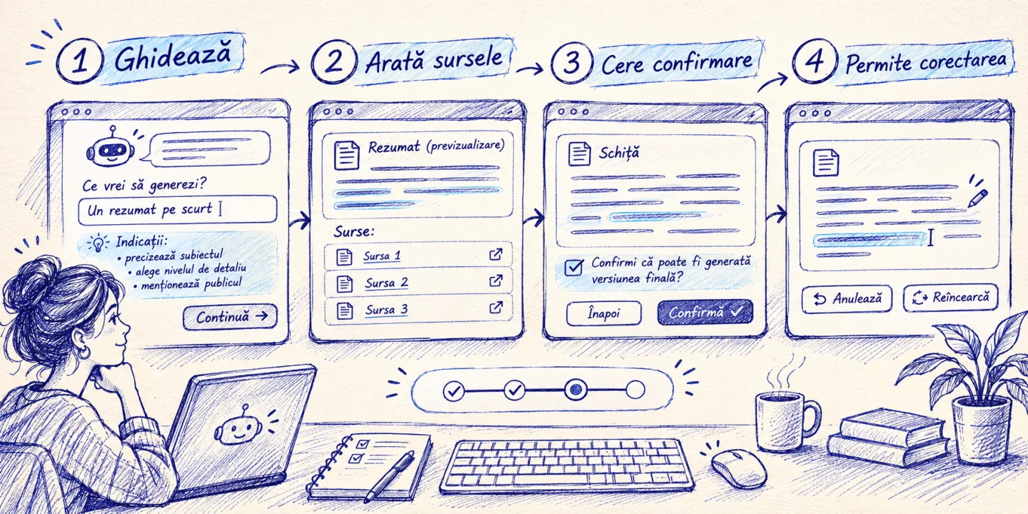
For two years now, almost every product has received a chat box and a spark icon. One rarely questions whether the user really meant to write. Classic interfaces required you to know which buttons to press. AI interfaces require you to know what to ask for, and that’s sometimes harder. Good design in the age of AI isn’t about adding an assistant everywhere, it’s about choosing when to help, what trust looks like, and what happens when the system goes wrong. Below are the principles I apply in projects.
In short
- Chat is not the right interface for everything. For repetitive tasks, well-thought-out buttons and forms beat a conversation.
- The user needs to see what the system is doing, where it got the information, and how secure it is.
- Humans are in control: suggestions that can be accepted, modified or rejected, and actions that can be undone.
- Mistakes are certain, so their design is part of the product: clear messages, emergency exits, way to a human.
- Accessibility and speed matter even more when content is dynamically generated.
Chat is a tool, not a strategy
The chat box has a huge advantage: it accepts anything. There is also his weakness. The blank page forces the user to say what they want, without any indication of what the system can do. Many hesitate, write something vague and get an equally vague answer.
When chat works well:
- Open-ended questions with different answers each time (exploration, documentation, support).
- Situations where the user does not yet know what they are looking for.
- Conversations with changing context, where history tracking helps.
When another model is better:
- Known Tasks (Reschedule, Return, Change Address): A short form is faster than three dialog lines.
- Choices from a set (packages, variants, filters): buttons and lists, not free text.
- Content Editing: suggestions directly in the text, not in a separate window.
The best combination, in my experience, is chat with start suggestions and quick actions. Instead of “How can I help you?”, you display three or four things that the system actually does: “Check order status”, “Calculate an offer”, “Schedule a discussion”. The user immediately sees what is possible and clicks without typing.
Make visible what the system is doing
One of the big differences with classic software is that the result is not perfectly predictable. The user does not know whether to trust. The interface can help him, and the most effective means are simple.
Show sources. An answer that says “per return policy, section 3” and provides a link is verifiable in seconds. Confidence comes from being able to verify, not from confident tone.
Shows progress. When the system is working for a few seconds (searching, comparing, writing), an indicator that says “Searching the documents… Preparing the answer…” is more reassuring than a generic wheel. The user understands that something is happening and what.
Say when you don’t know. “I couldn’t find this information in the available documents. Would you like me to put you in touch with a colleague?” that’s an excellent answer. A system that recognizes its limit gains more confidence than one that responds to everything.
Don’t mimic the man. The fake name, photo, and “I’m thinking…” messages with theatrical pauses may seem cute, but they’re deceiving. It clearly states that it is an AI assistant. Users have the right to know, and the regulations in the European Union are also moving in this direction.
Control remains with the user
A principle that guides me: the AI proposes, the human decides. It translates into some concrete interface patterns.
- Suggestions, not impositions. Generated text appears as an editable draft. The automatically filled field remains editable.
- Preview before action. Before the system sends an email or changes an order, it shows exactly what it will do and asks for confirmation.
- Easy undo. Every important action can be undone. A “Cancel” button visible for a few seconds greatly reduces anxiety.
- Simple adjustments. Ability to request “shorter”, “more formal” or “show me alternatives” in one click, without rewriting the instruction.
- Option to turn off. User can disable auto-suggestions. Not everyone wants them.
These patterns have a dual effect: they reduce the risk of mistakes and increase the sense of control that is the basis of trust.
The design of mistakes
Any AI system makes mistakes. The question is what the user sees when it happens. A good interface treats failure as a common scenario, not an exception.
Some situations and how to cover them:
| The situation | The poor answer | The good answer |
|---|---|---|
| The system does not understand the request | “An error occurred.” | “I didn’t quite understand. Can you rephrase or choose one of the options below?” |
| The AI service is unavailable | Endless wheel | “The assistant is not answering right now. You can fill out the form or call us.” |
| The answer seems wrong | No means of signaling | “Incorrect Answer” button and road to a human |
| Demand exceeds capacity | Made up answer | “I need a colleague for that. I’m forwarding the conversation to you.” |
In all cases, the user has an exit: a human, a form, a phone number. An assistant that locks you in a dead loop does more harm than the lack of it.
There is one more aspect: feedback. A simple “helpful / didn’t help” next to each answer produces valuable data for improvement and shows the user that their opinion matters.
Speed is part of the experience
Language models can take seconds to respond, and a second of waiting with no sign of life feels long. Some Perception Shifting Techniques:
- Streaming. The response appears as it is generated, not at the end. The first words arrive in under a second, and the user starts reading.
- Optimistic interface for safe actions. If an action almost always succeeds, show the result immediately and confirm in the background.
- Loading skeletons instead of blank screens so the page doesn’t “jump” when content arrives.
- Pre-prepared answers for frequently asked questions, which no longer go through the template.
Latency correlates with trust: a product that responds quickly appears competent. On the technical side, it’s also worth looking at how to do fast APIs under pressure, because the interface can’t be faster than the services behind it.
Accessibility: Generated content is unapologetic
Dynamically generated content creates accessibility issues that designers easily overlook. An answer that appears in a box without a screen reader knowing about it is invisible to visually impaired users. A mouse-only assistant excludes people who navigate with a keyboard.
Minimum checks I do:
- Live regions. New messages are announced by the
aria-liveattribute, to be read automatically. - Keyboard navigation. Chat box can be reached, message can be sent and suggestions can be used only with keys.
- Contrast and size. The generated text follows the same contrast rules as the rest of the page and can be enlarged without spoiling the appearance.
- Simple language. You instruct the system to use short phrases and common words. It benefits everyone, not just those with reading difficulties.
- Alternative. Every essential function also has a non-AI path.
Accessibility is not a layer added on top. It’s an acceptance criterion, just like functionality.
Writing is part of the interface
In an AI product, much of the experience is text: assistant responses, error messages, button labels. Tone projects as carefully as a screen. Some rules that work:
- Short and to the point. A four line response with a clear next step beats a sixteen essay.
- One tone. The assistant speaks the same in all situations, polite and direct, without forced exclamations and without jargon.
- Next step at the end. Each answer ends with what the user can do next: a link, a button, a clarification question.
- No promises that the system cannot keep (“I’ll fix it right away”, “I’m sure that”).
The beginning counts: the first thirty seconds
Users judge an assistant from their first interactions. A good first experience has a short welcome message that says what the assistant knows how to do, two or three starting suggestions, and an honest statement about limits (“I can be wrong, check the important information”). Don’t ask for an account, don’t ask for personal data before you show value. If the first answer helps, the user returns. If not, there is no second chance.
Customization with measure
The AI can adapt the interface to each user: recommended content, order of options, tone of messages. Used sparingly, customization saves time. Pushed too far, it becomes unsettling (“how does it know that?”) or limiting, because the user no longer sees the options the system has hidden.
Simple rules: explain why you’re seeing a recommendation (“because you ordered…”), provide a way to correct it, don’t personalize based on sensitive data, and keep a stable structure. A menu that changes its place according to “predictions” is no longer a menu, but a maze.
A pre-launch checklist
When evaluating an AI interface, I run through a few questions:
- Is it clear what the assistant is good for and what it isn’t?
- Any suggestions to start so the page isn’t blank?
- Can you see where the information is coming from?
- Can the user correct, cancel and refuse?
- What happens when the system doesn’t know or doesn’t work?
- Is there a way to a man?
- Can it be used with keyboard and screen reader?
- Is it fast enough and the wait explained?
If the answer to two or more is “no”, the product is not ready yet, no matter how good the model behind it is.
Conclusion
The best AI interface is often the least noisy: it helps at the right time, says what it’s doing, leaves human control, and is honest when it’s wrong. Confidence comes not from visual effects or animated sparks, but from small, repeated facts: the displayed source, the cancel button, the honest error message. Technology changes rapidly. These principles remain valid.